FunLearn — Connected Learning Experience
Context
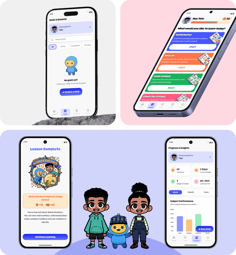
FunLearn is a gamified K–12 learning app designed around Nigeria's primary school curriculum. It helps children learn independently while giving parents a simple way to set goals, track progress, and celebrate growth — on devices that are often shared and offline.
The Problem
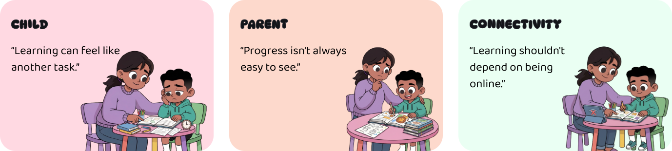
Children can complete learning activities without necessarily understanding the topic or feeling motivated to continue. For parents, the challenge is different — they want to support their child's learning but struggle to understand what their child is learning, where they're struggling, and whether they're improving. In a low-connectivity environment, reliable internet cannot be assumed.
Objectives
- —Keep children motivated and engaged with short, rewarding lessons.
- —Give parents clarity on progress without constant supervision.
- —Make learning feel like play, not another task.
- —Work reliably in low-connectivity environments.
Research & Discovery
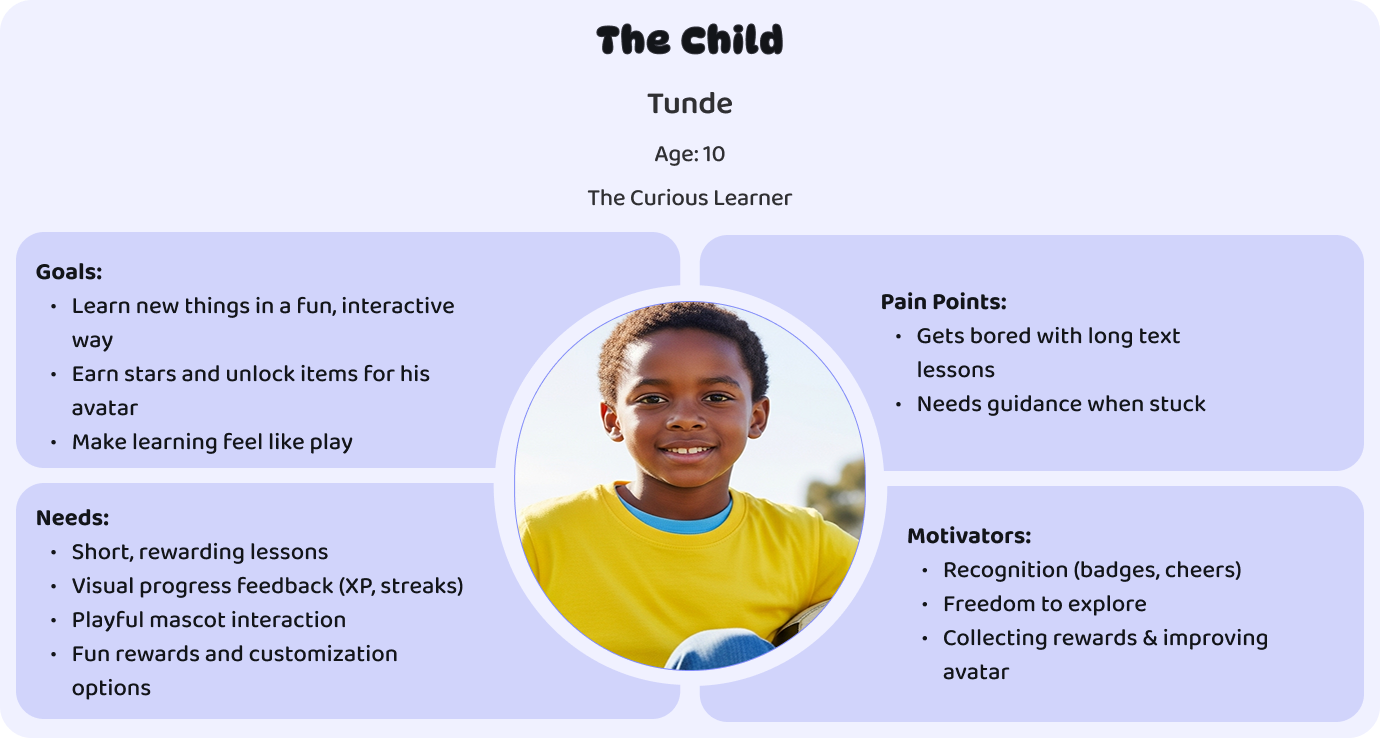
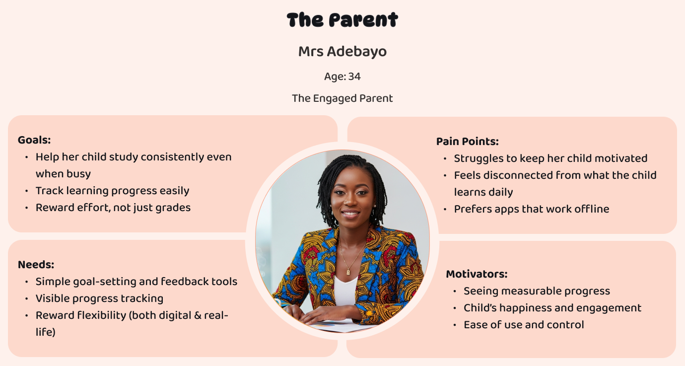
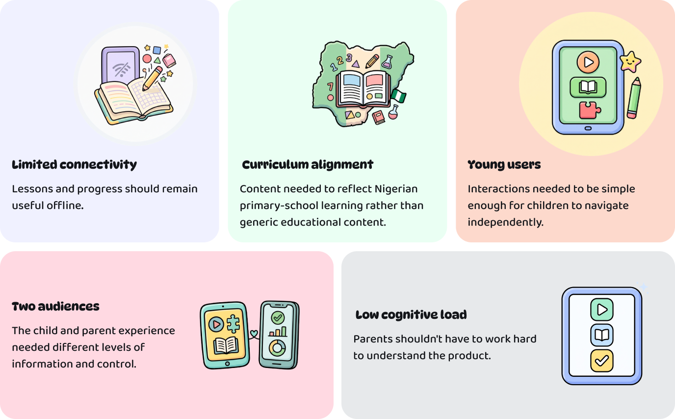
I started from two user profiles — the child (Tunde, 10, the Curious Learner) and the parent (Mrs Adebayo, 34, the Engaged Parent) — and mapped their goals, pain points, needs, and motivators. From there I identified five design constraints that shaped every decision.
The Constraints
FunLearn wasn't designed for an ideal environment where every child has fast, reliable internet. Five constraints shaped every decision.
The Solution
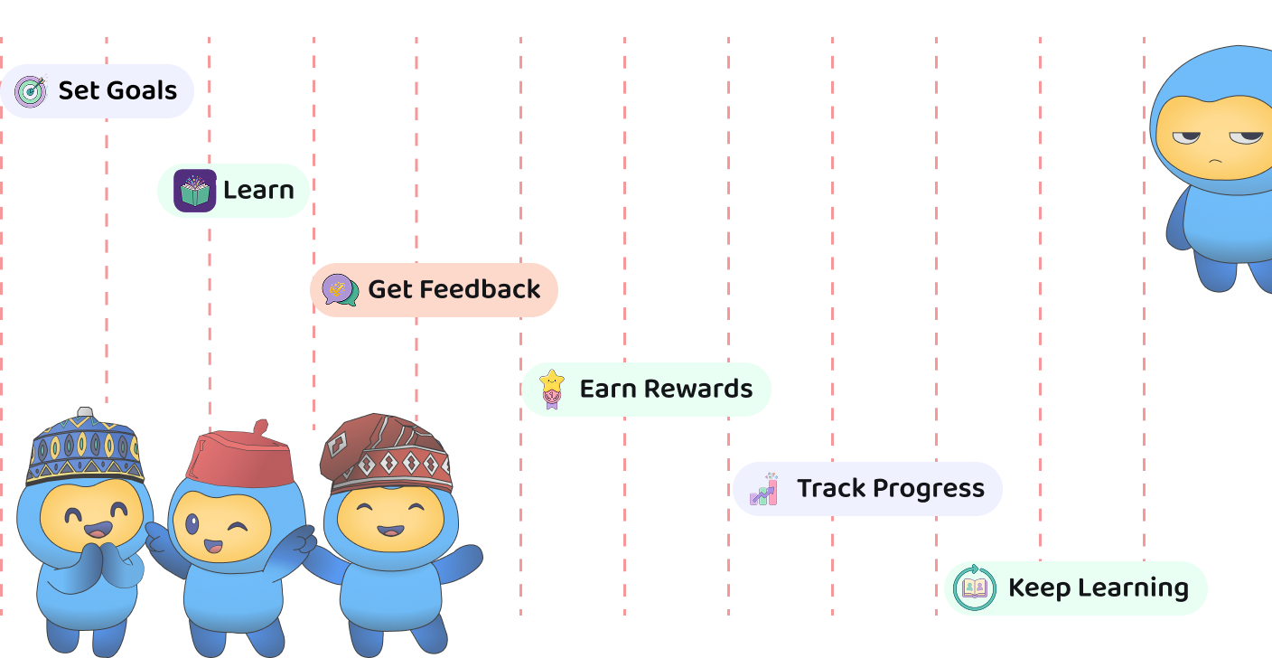
I shifted the experience from lessons to goals. Instead of asking 'what lesson should I start?', FunLearn asks 'what are we trying to achieve?' That reframing led to a core product loop: Set Goals → Learn → Get Feedback → Earn Rewards → Track Progress → Keep Learning.
Product Idea — From Lessons to Goals
The core loop reframes the experience around intention rather than content. Parents set meaningful goals, children work toward them, and every lesson feeds back into visible progress.
Designing the First Goal
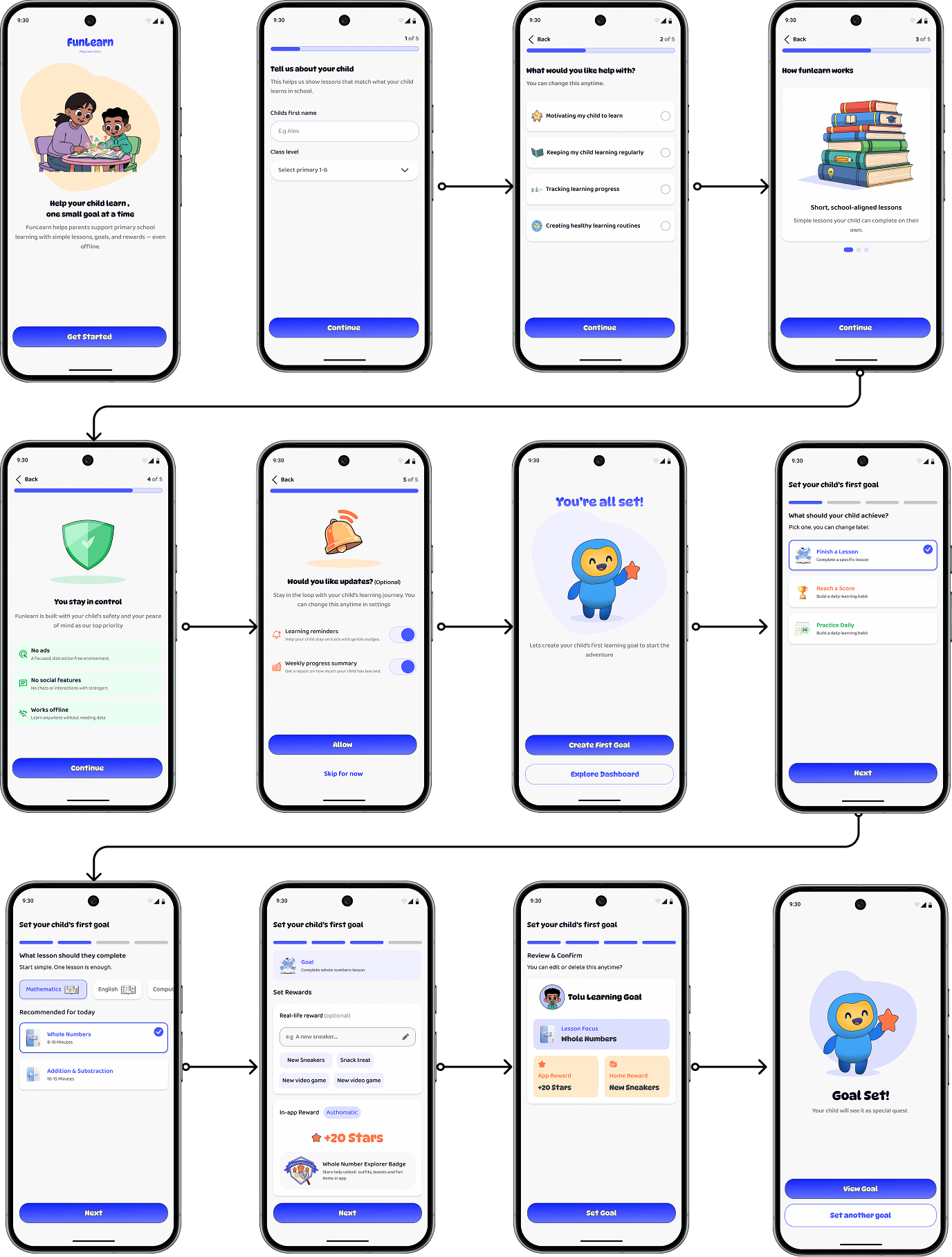
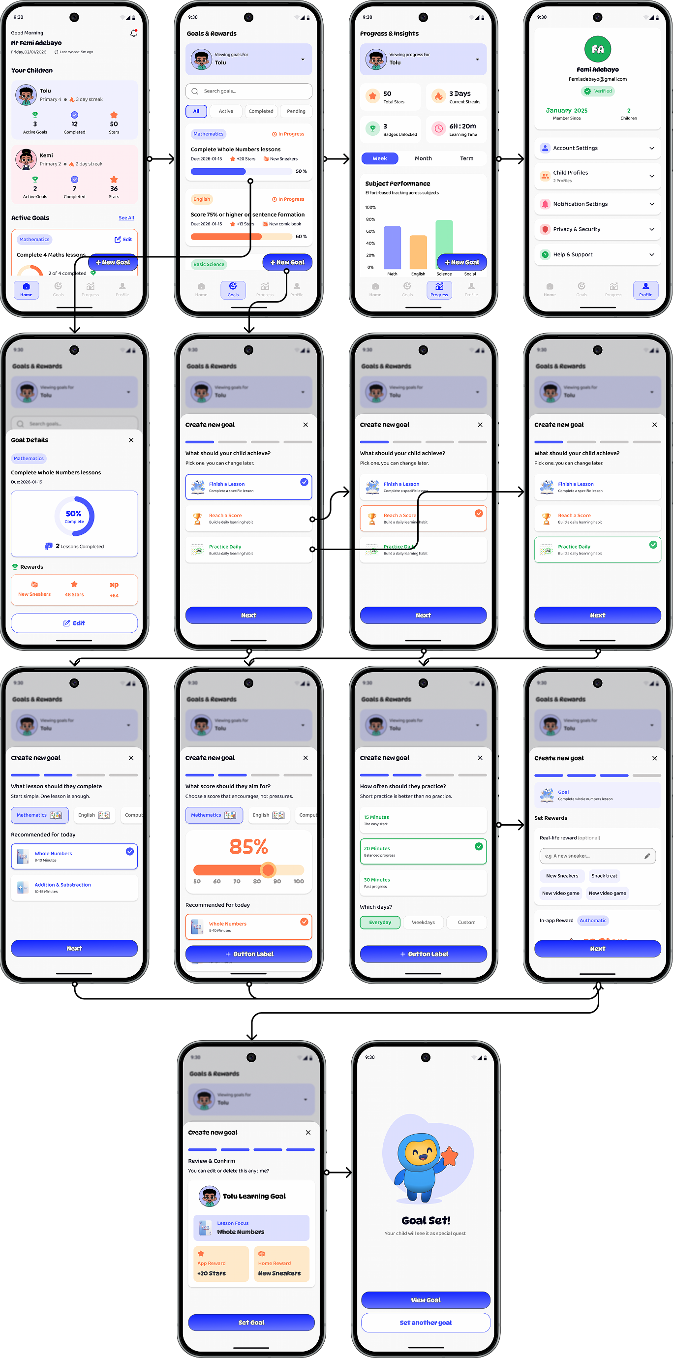
Rather than asking parents to configure everything at once, onboarding progressively introduces Child → Focus → Goal → Reward → Review. This gives parents control without turning setup into a form-filling exercise.
Learning Journey
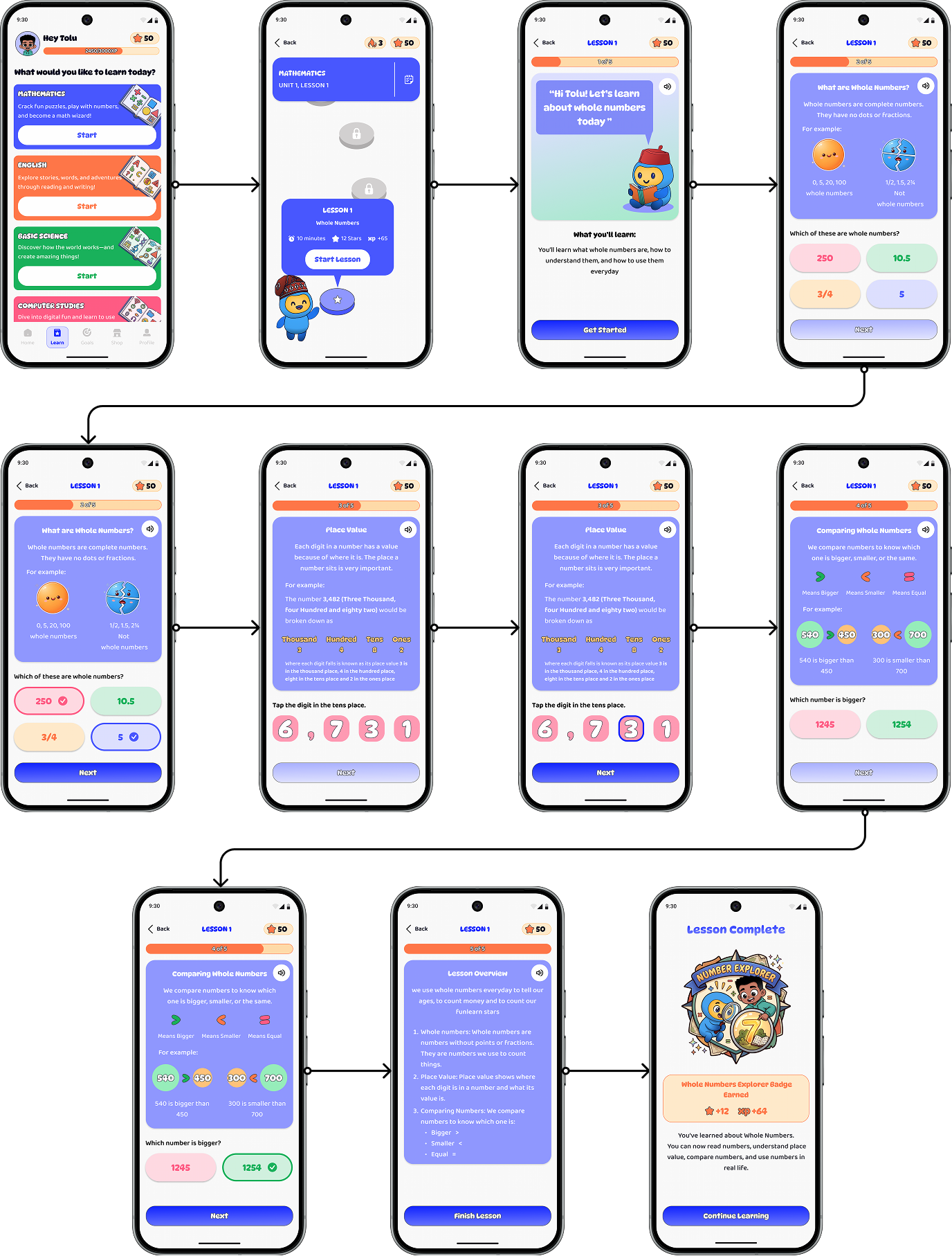
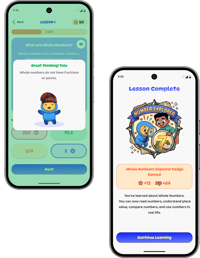
One of the biggest challenges was turning an academic topic into something a child could move through. I used 'Whole Numbers' as the prototype topic and structured it into five smaller steps: What are whole numbers? → Place value → Comparing numbers → Practice → Check understanding. The result is a clear progression: Understand → Practice → Apply → Check.
Designing Feedback
Getting an answer wrong shouldn't feel like failing. Feedback works in three layers — Confirmation ('You got it right'), Reinforcement ('Here's why'), and Reward ('Here's what you earned'). Incorrect answers encourage another attempt instead of ending the experience.
Making Progress Feel Rewarding
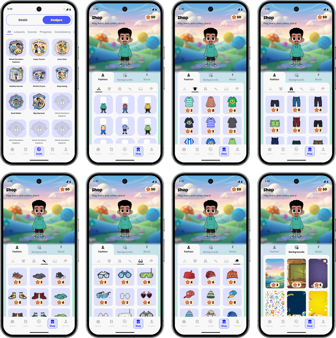
Badges celebrate achievement, stars give progress value, and the Avatar Shop makes rewards actionable. The motivation loop is simple: Learn → Earn → Spend → Customize → Keep Learning. Badges celebrate progress, stars create value, and customization creates motivation.
The Parent Experience
Parents shouldn't have to become data analysts. The parent interface was built around one question: 'What do I need to know about my child's learning right now?' The flow is Goals → Rewards → Progress & Insights.
Design System
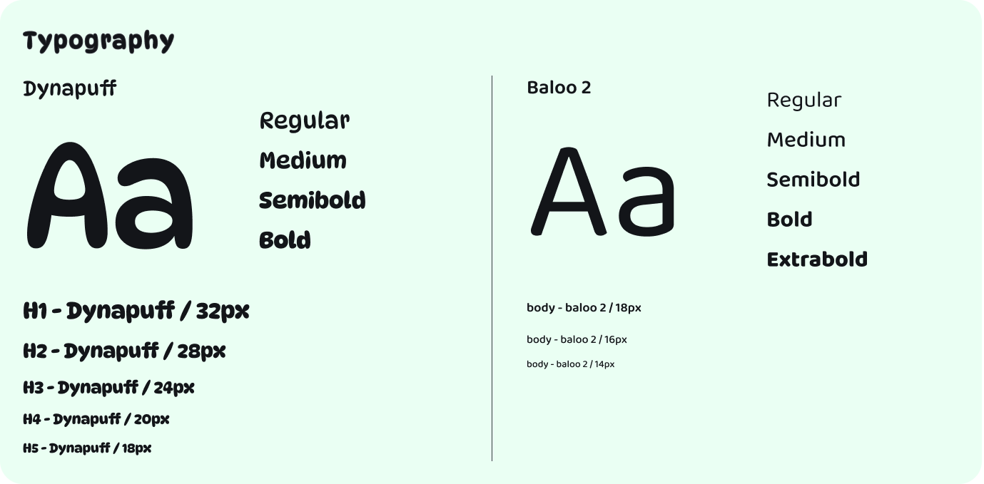
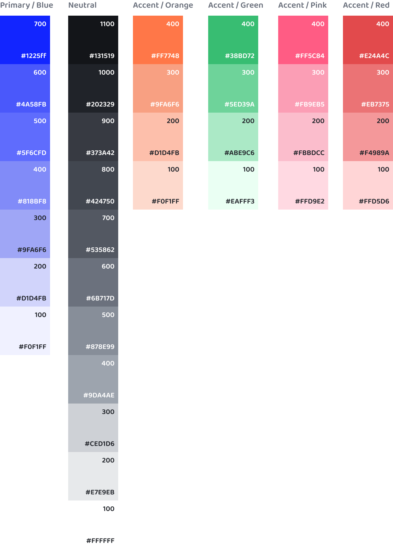
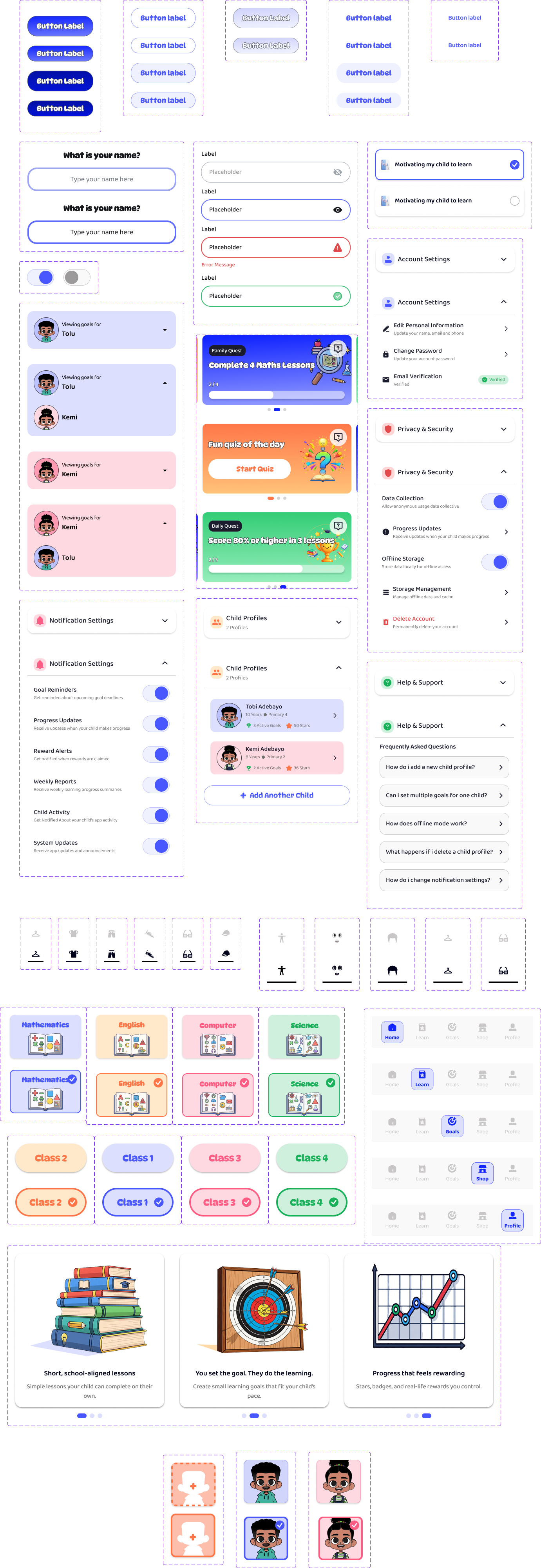
A lightweight design system kept FunLearn playful for children, clear for parents, and consistent across the experience. The colour system balances playfulness with clarity — using colour to communicate action, progress, rewards, and feedback.
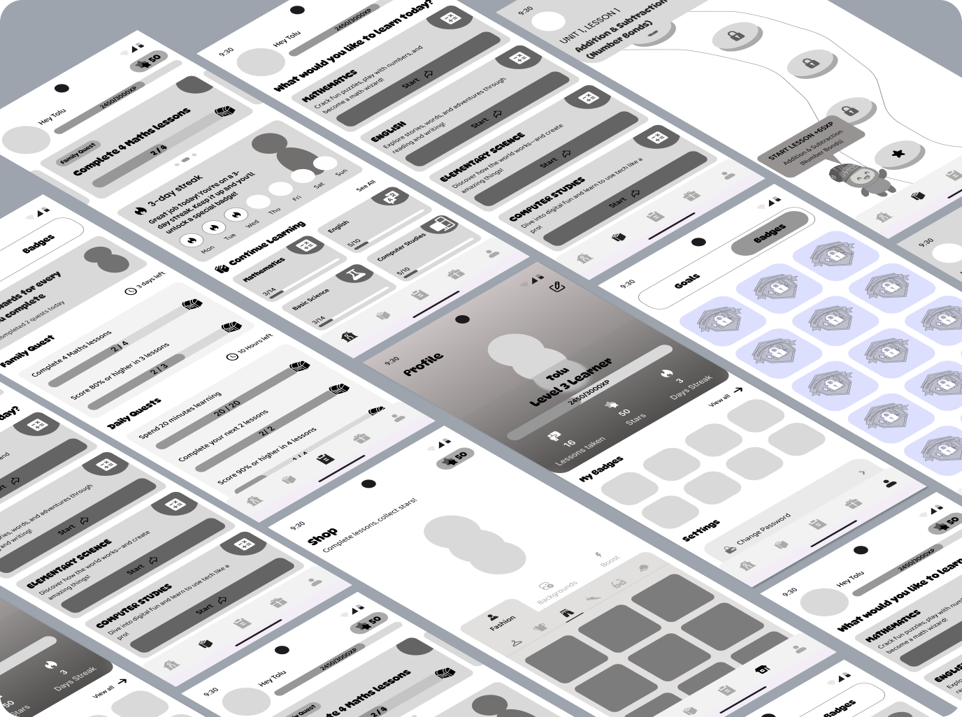
Wireframes
Prototype
Two connected flows — one for the child, one for the parent. Tap through to see how the experience comes together.
Outcome
FunLearn is a portfolio prototype, not a shipped product — so I'm not presenting fabricated post-launch metrics. The concept evolved from a simple learning app into a connected learning loop: Lessons → Goals → Feedback → Rewards → Progress. The child experience moves through Learn → Practice → Improve → Earn → Continue, while the parent experience moves through Set → Guide → Monitor → Celebrate. Both connect through shared learning goals and progress.
What I Learned
01 — Content comes first. Educational UX is about how information is taught, not just how it looks.
02 — Motivation needs a system. Stars and badges work best when connected to meaningful learning behaviour.
03 — Simplicity depends on the user. For children: intuitive and engaging. For parents: clear and actionable.
04 — Constraints shape better decisions. Designing offline-first forced me to focus on what the product truly needs.