Trip — AI Travel Planner
Context
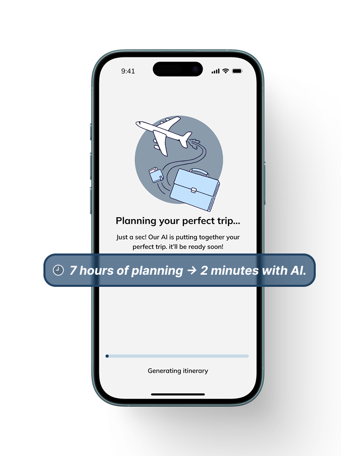
Planning a trip in Africa often means juggling multiple apps, hidden fees, and generic recommendations. Trip is an AI-powered mobile travel planner that cuts planning time from hours to minutes while delivering personalized itineraries with local context.
The Problem
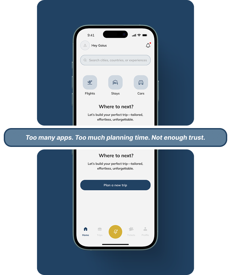
Travelers in Africa struggle with fragmented planning tools that lack real-time adjustments, personalization, and localized insights — making trip planning stressful, time-consuming, and less culturally relevant. The solution was a unified AI-powered travel planner that integrates bookings, itineraries, personalization, and local insights into a single seamless flow.
Objectives
- —Cut planning time from hours to minutes with AI-generated itineraries.
- —Replace multiple apps with one cohesive interface.
- —Personalize recommendations based on traveler preferences.
- —Build cultural context and local trust into every trip.
Research & Insights
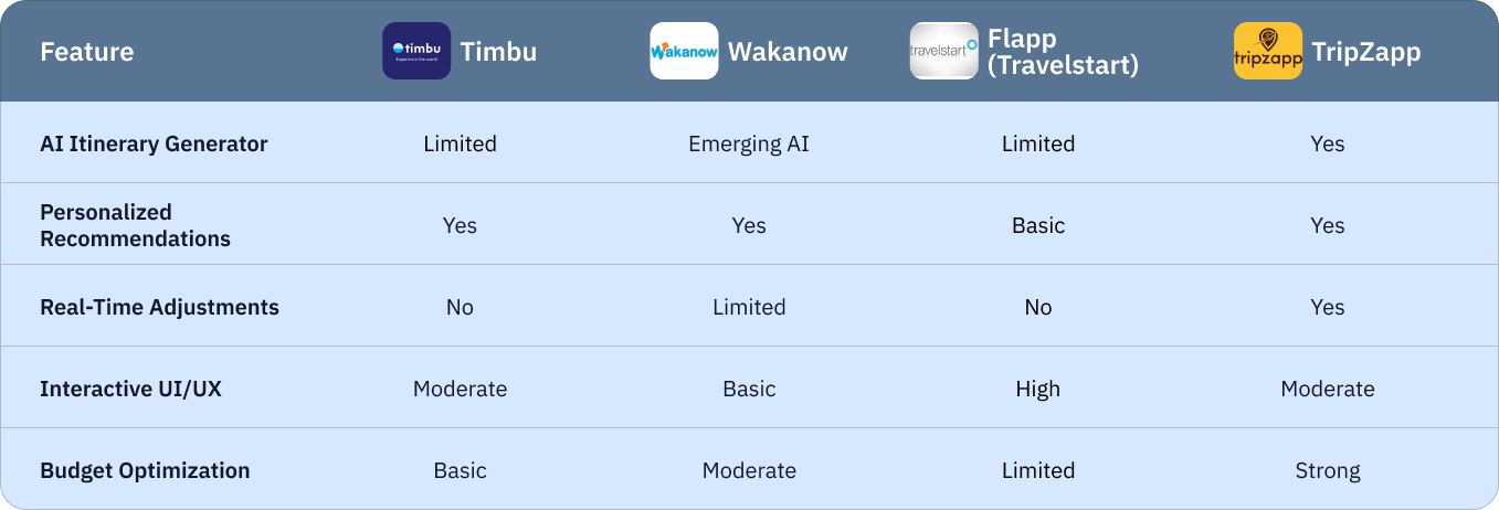
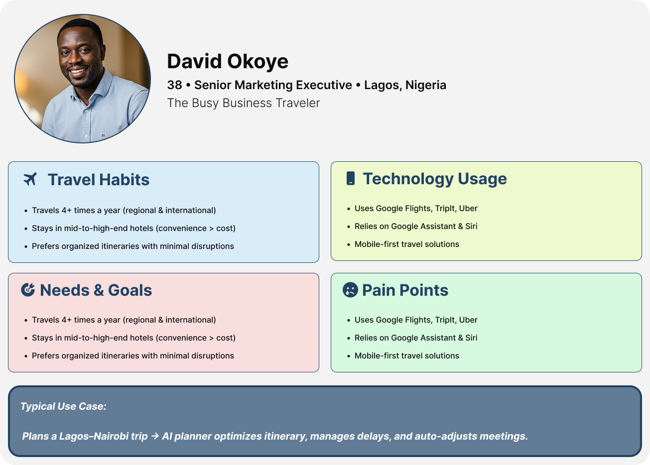
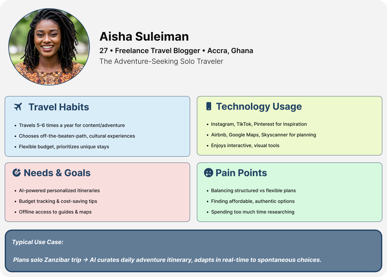
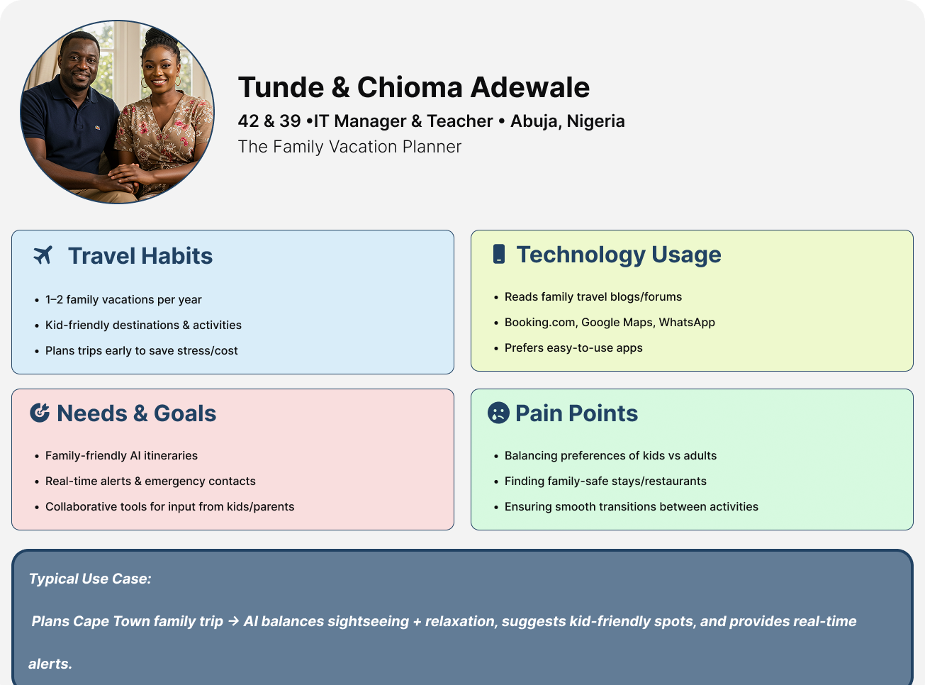
I ran a competitive analysis across four leading African travel apps — Timbu, Wakanow, Flapp (Travelstart), and TripZapp — and conducted a quantitative survey with 14 frequent travelers. The research surfaced four clear opportunities: AI-driven real-time adjustments, voice and chat assistants, hyper-personalized itineraries, and localized cultural experiences.
The Solution
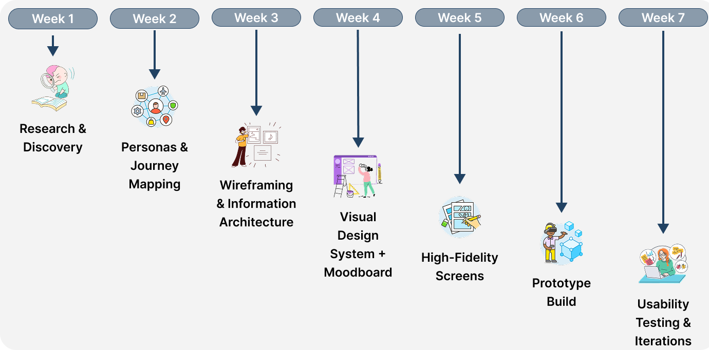
A 7-week design process took Trip from research through usability testing. The app is built around one belief: planning a trip should feel effortless, personalized, and trustworthy — not stressful.
Design Process & Timeline
A structured 7-week flow: research and discovery, personas and journey mapping, wireframing and information architecture, visual design system, high-fidelity screens, prototype build, and finally usability testing with real travelers.
Information Architecture
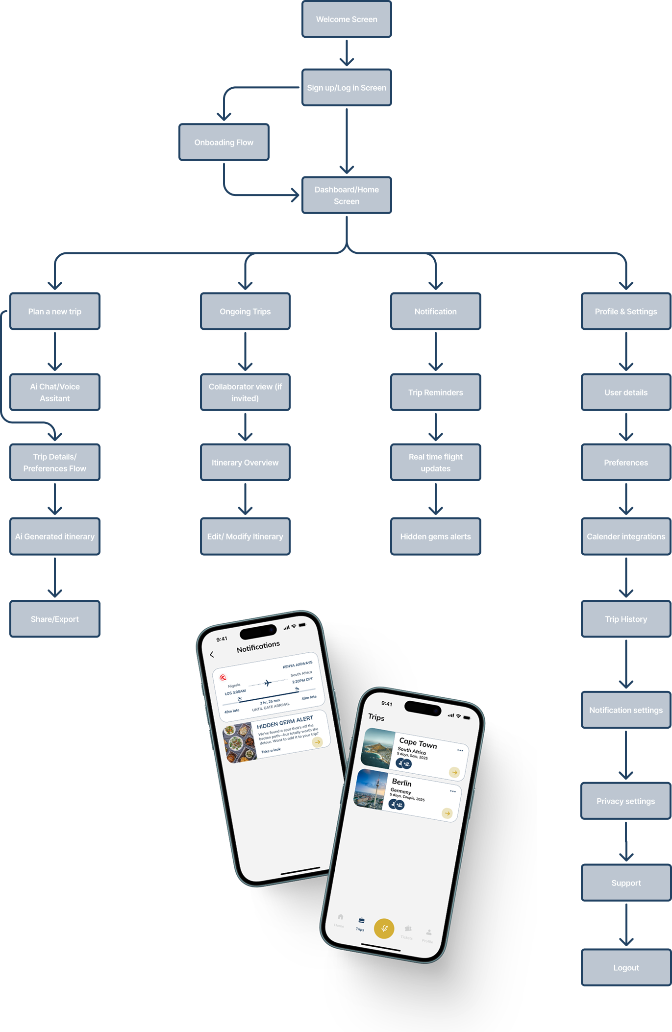
The IA maps how travelers move through Trip: from welcome screen and sign-up, through onboarding and dashboard, then branching into four core areas — planning a new trip, ongoing trips, notifications, and profile settings. Each branch opens into the flows that support it, like AI chat planning, itinerary editing, and trip sharing.
Onboarding Experience
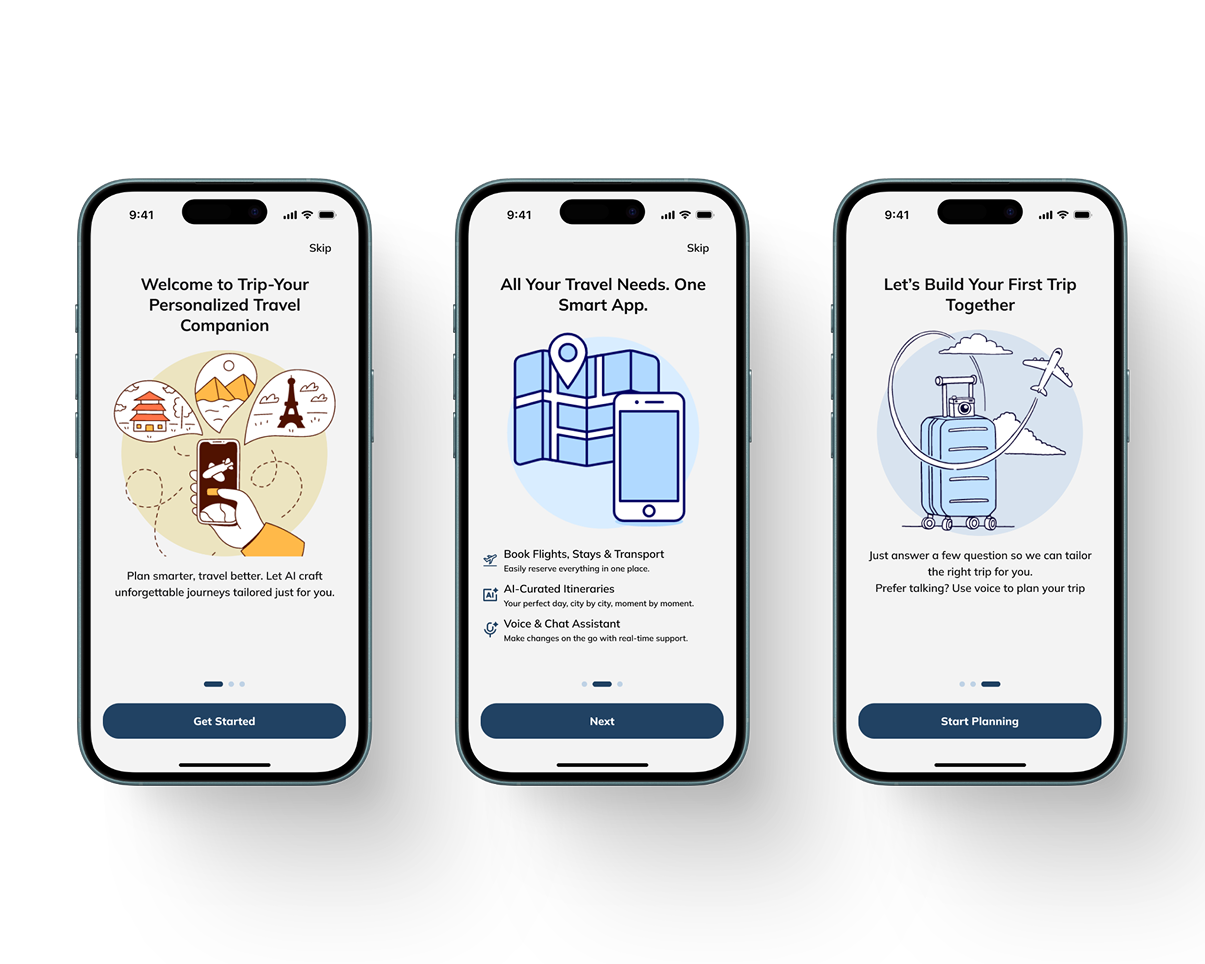
Three screens welcome the user, showcase the app's value, and guide them into their first trip. Copy is warm and direct — the goal is to build trust quickly without overwhelming new users.
Home & Itinerary Screens
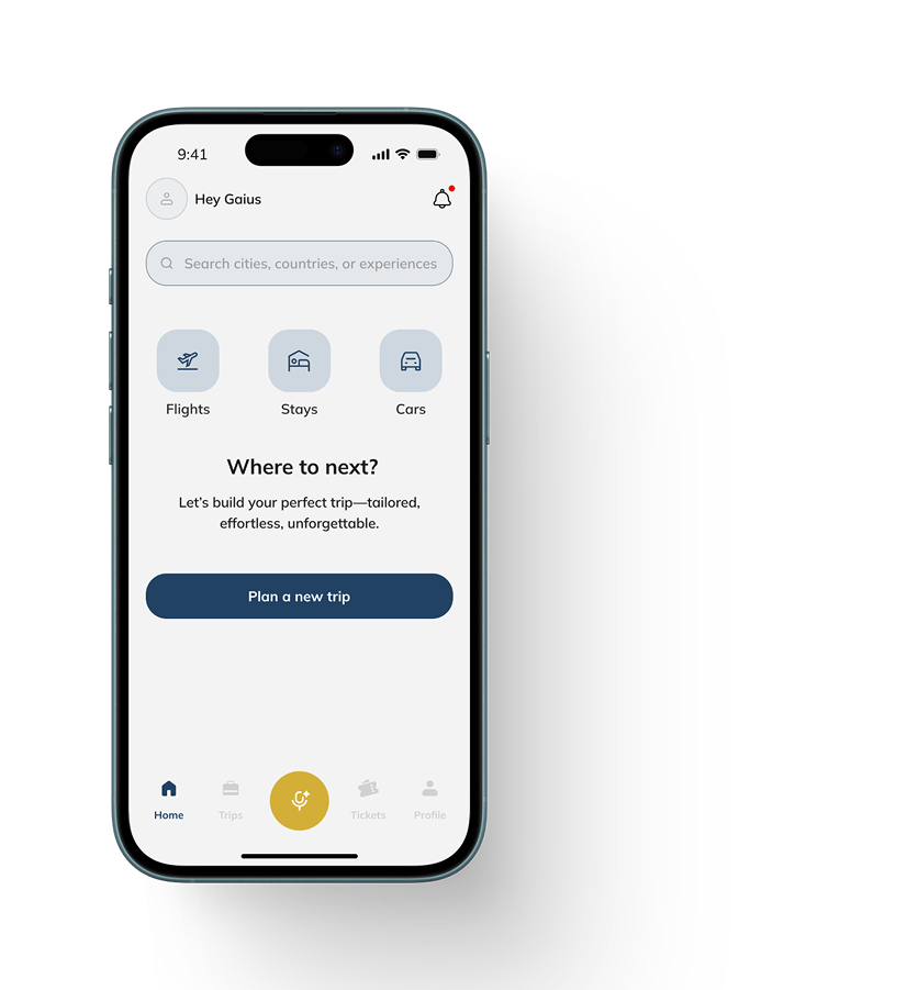
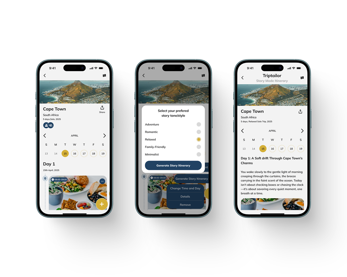
The home screen is a clear hub for quick actions: flights, stays, cars, and the primary 'Plan a new trip' call. The itinerary screen presents each day as a timeline — and a Story Mode reimagines the plan as a narrative you can relive.
Booking Experience
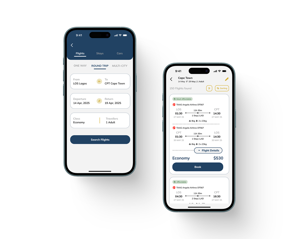
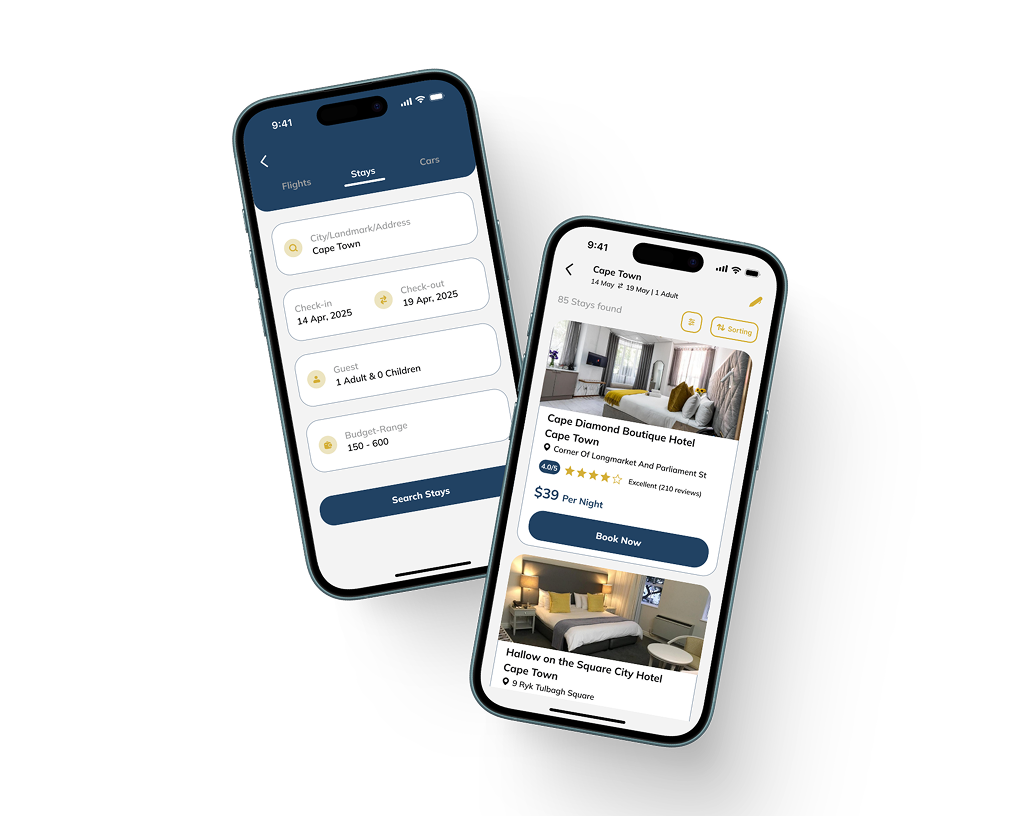
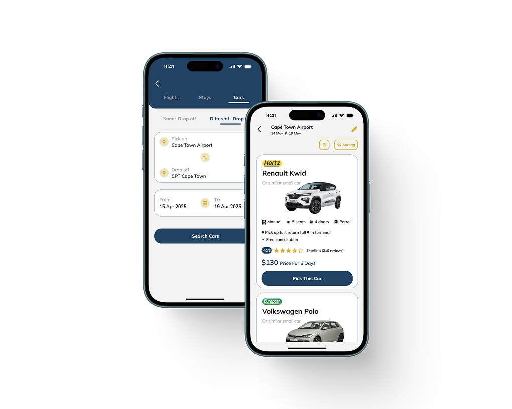
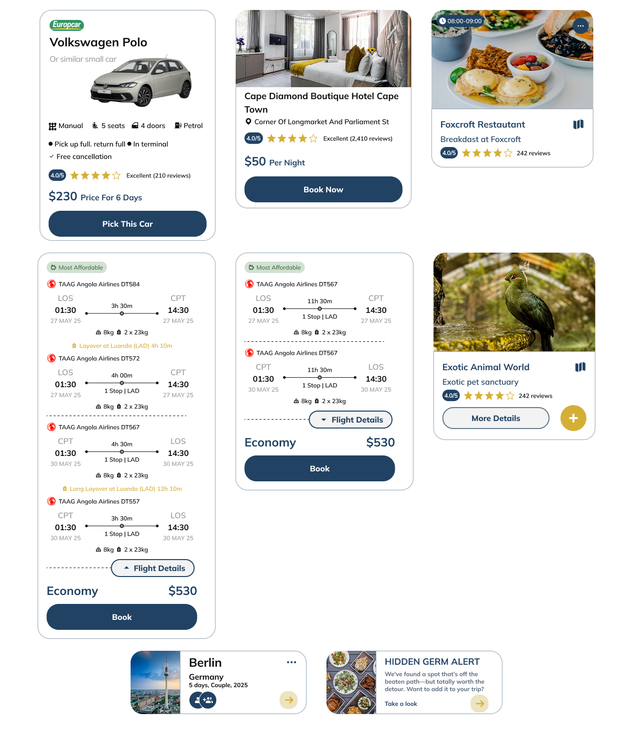
Flights, stays, and cars follow a consistent card-based pattern. Filters, ratings, and AI suggestions make options clear and easy to compare — reducing the stress of choosing.
AI Chat & Voice Assistant
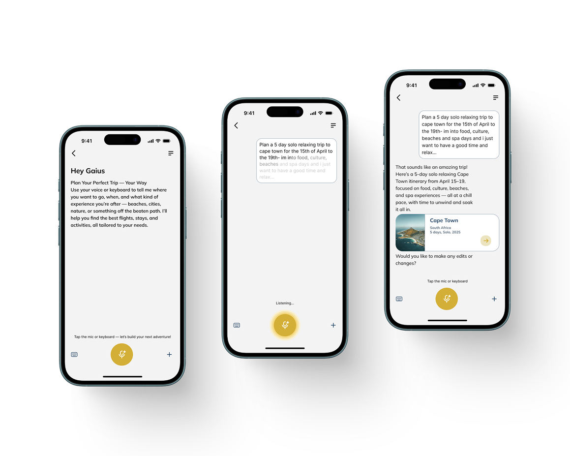
The AI assistant turns planning into a conversation. Users can type or speak — 'Plan a 5-day solo relaxing trip to Cape Town' — and get a full itinerary back in seconds. This dual-mode interaction is what sets Trip apart from traditional planners.
Visual Design System
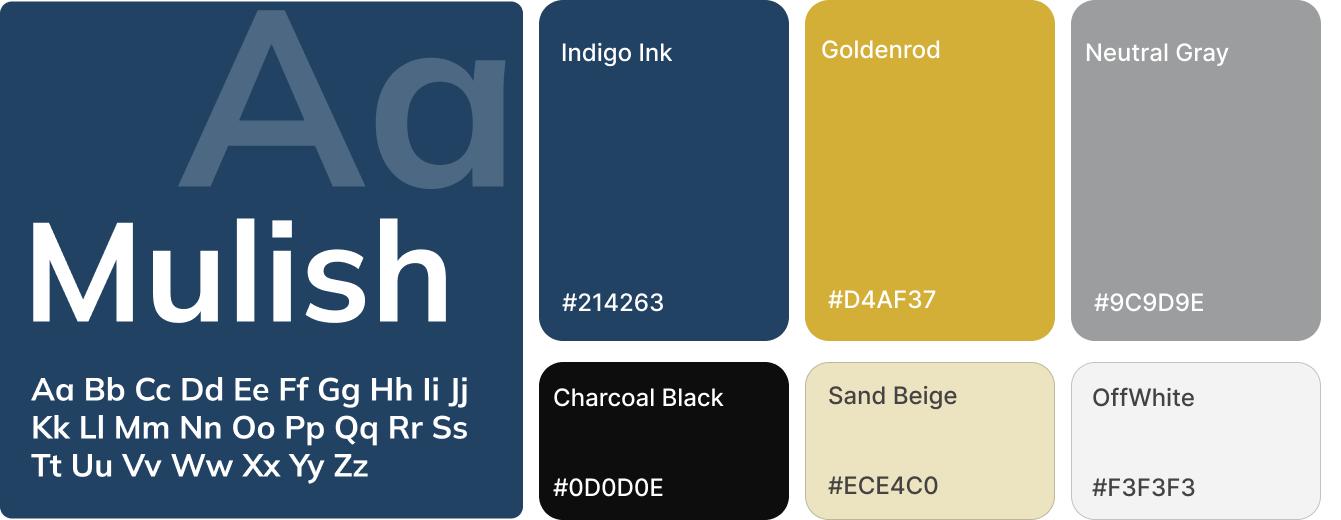
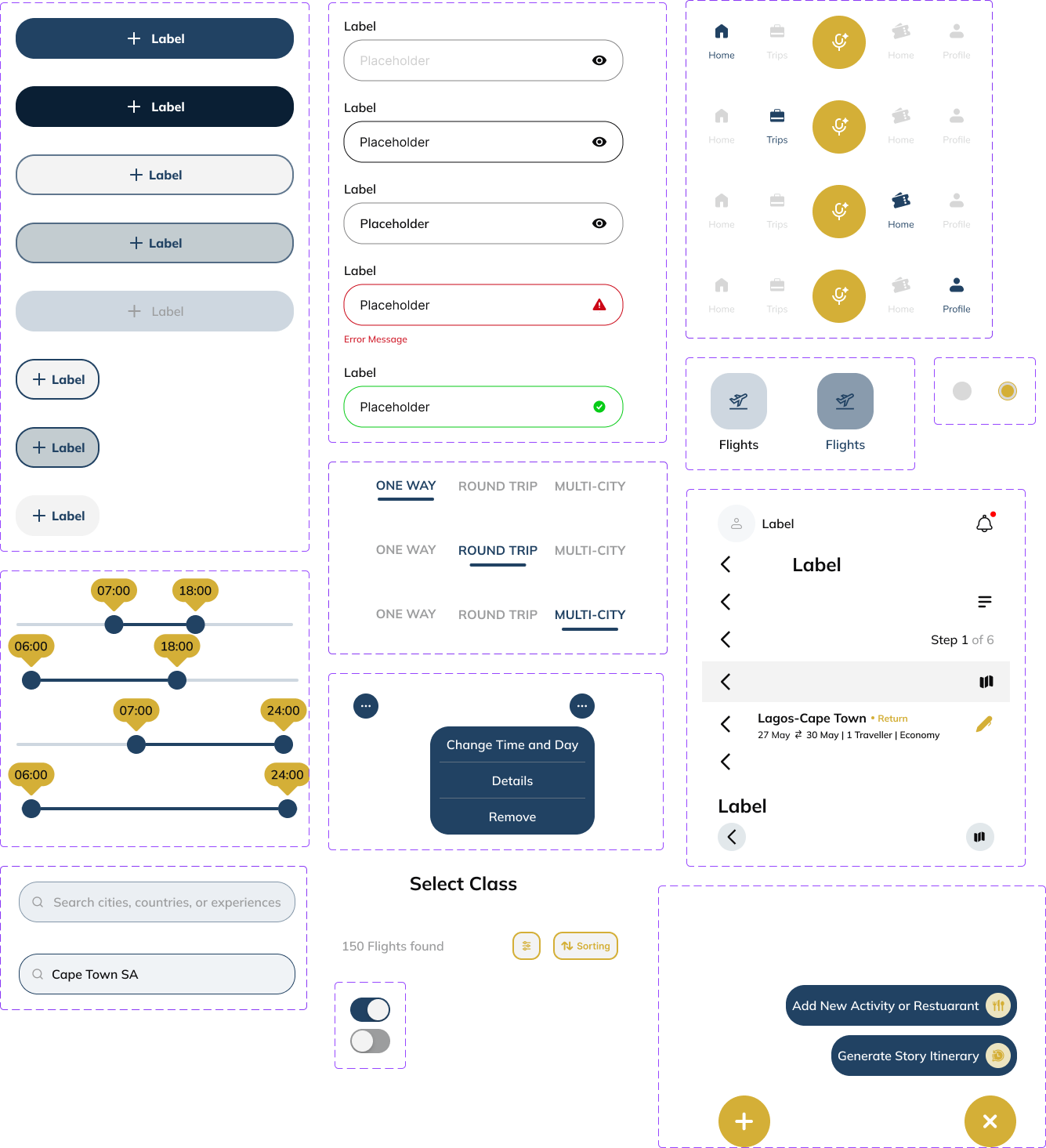
The visual identity follows a minimalist, elegant style — deep blues, rich gold, and soft neutrals reflecting trust, luxury, and simplicity. Mulish was chosen for its clean, modern, and highly legible personality.
Full UI Screens
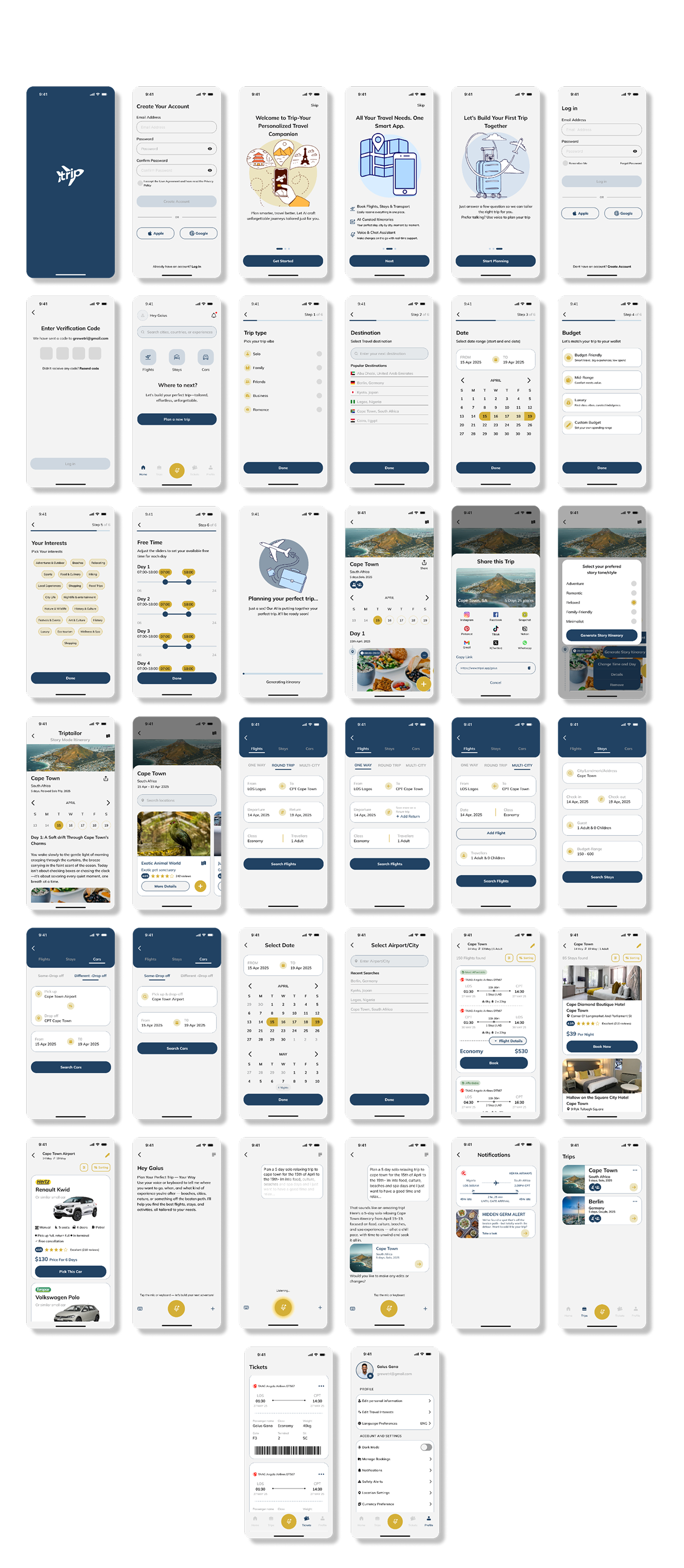
A complete screen library covering onboarding, planning, itinerary, booking, AI chat, notifications, and profile — all connected through the same modular card system.
User Testing
To validate the design, I ran a usability test with 6 participants representing diverse traveler types and experience levels. The goal was to assess how easily users could complete core tasks — creating an account, planning an itinerary, and booking flights or stays.
Key Insights
- —Signing up was quick and easy for all users.
- —AI itineraries were helpful, but users wanted a simpler way to edit — like drag-and-drop.
- —Users wanted more control over budget and trip interests when planning.
- —Booking flows were smooth, but pricing wasn't always clear enough.
Outcome
Trip was validated with 6 participants from diverse traveler segments. All core tasks — onboarding, itinerary creation, and booking — were completed successfully. The feedback surfaced three clear improvements for a future iteration: drag-and-drop itinerary editing, budget sliders and interest filters, and transparent pricing breakdowns across bookings.
Reflections for Future Projects
If I worked on a similar project again, I'd add drag-and-drop functionality to make itinerary customization more intuitive.
I'd provide budget sliders and interest filters so users can personalize their plans more precisely.
I'd introduce transparent pricing breakdowns to build trust across bookings.